使用 matplotlib 遇到的几个问题
这周在用 matplotlib 画几张图。数据 csv 下载自 ECBStat 和 FRED。
import pandas as pd
import matplotlib as plt
首先是解决字符串转日期型的问题。我希望将日期作为横轴,而且显示合理。
使用 datetime。
from datetime import datetime
x = datetime.strptime(d, '%Y-%m-%d').date() for d in example.date

# example.date 是我的 example.csv 文件中日期对应列。

plt.plot(x,y)
更多时间处理参数,详见下方链接。
自动格式化:
plt.gcf().autofmt_xdate()
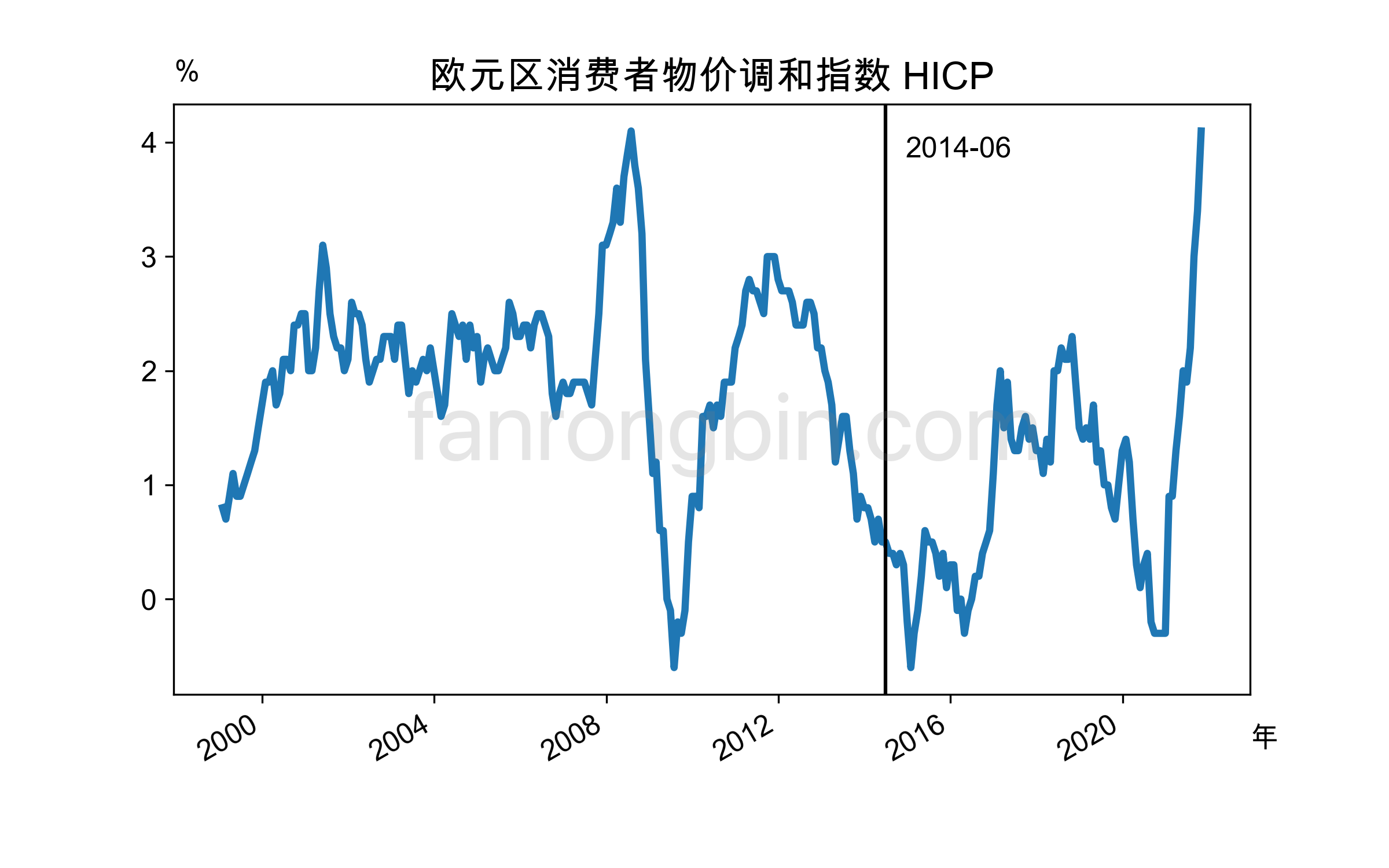
我希望定位一个具体日期,并用竖线标识。 这里用到pandas把我希望的具体日期转为时间戳。
plt.axvline(pd.Timestamp('2014-06-30'), color='#000')
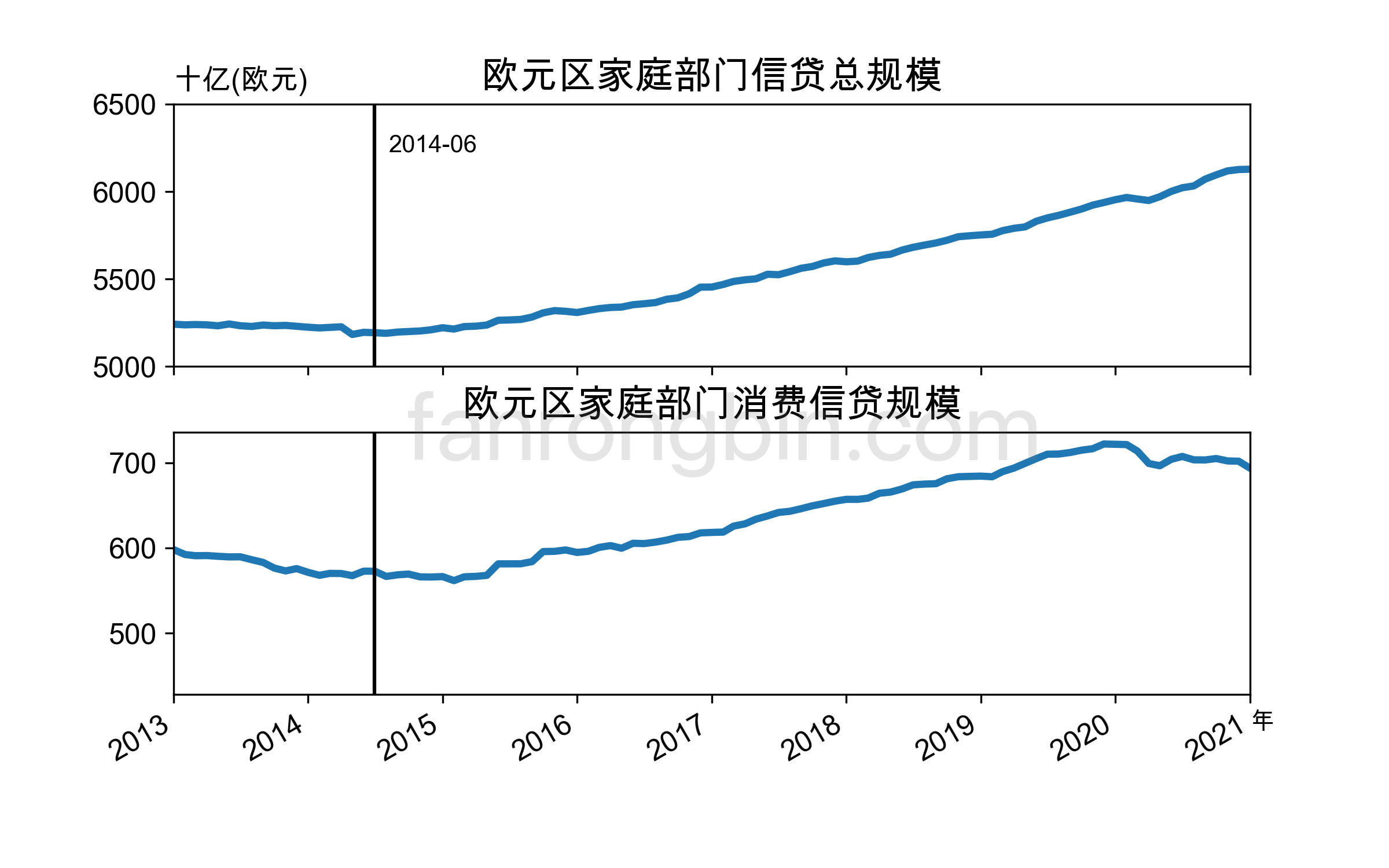
我希望在一张图(单个文件)中同时展示多个图表,既可以用 subplot,也可以用 GridSpec。
plt.subplot(211)
plt.plot(time, totalb)

plt.subplot(212)
plt.plot(time, conb)
也可以:
plt.GridSpec(2, 1, wspace=.25, hspace=.25)
ax1 = plt.subplot(grid[0,0:1])
ax1.plot(time, totalb)

ax2 = plt.subplot(grid[1,0:1])
ax2.plot(time, conb)
如何定义具体位置或查看更多实例,请见 matplotlib.pyplot.subplot 和 matplotlib.gridspec.GridSpec。
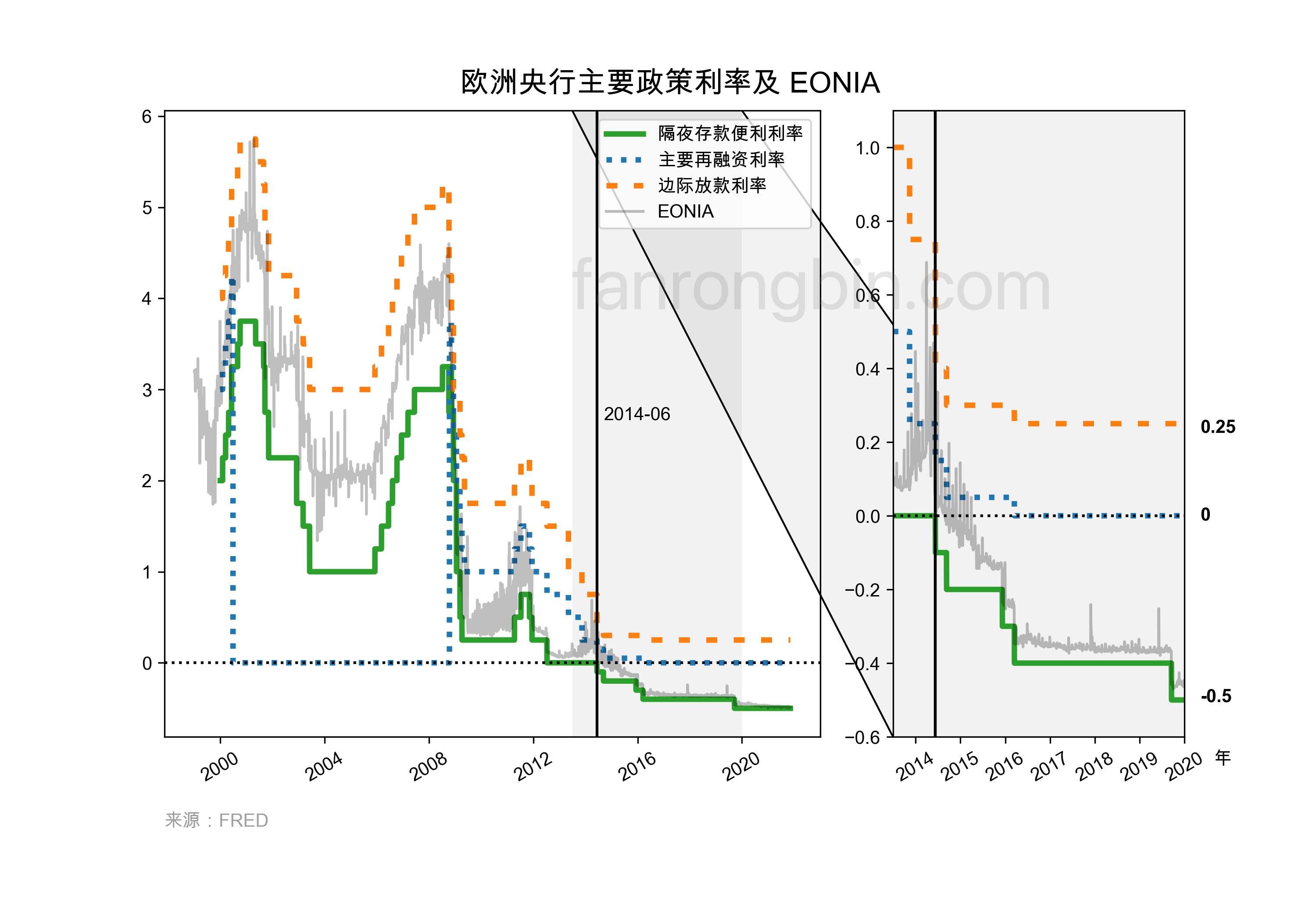
参考了实例 Axes Zoom Effect。
Login via Github